
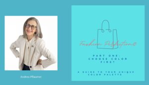
 Big news! I have FINALLY finished my color course! This week I’m recording the voiceover and will then upload it to my Teachable platform. I’ll let you know immediately when it’s available, and as always, I’ll be sending you a code for a HUGE discount as one of my loyal readers.
Thinking about color so deeply for so many years had a major impact on my life. I’ve become even more selective about how I use it in my wardrobe. I even found myself noticing and evaluating everything in my home from the perspective of color.
One of my favorite memes lately reads: “Set your home to sanctuary”. A sanctuary is a place of peace, and in my home that means eliminating clutter and messiness. So, I am not sentimental about “stuff”. If something isn’t useful or doesn’t bring me joy, out it goes. I simply need to see beauty and harmony wherever I look, and color is a major part of beauty and harmony. It’s a major factor in how I make my home feel like a sanctuary.
Beauty and Harmony
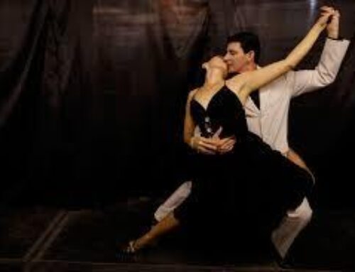
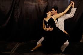
It’s also what I advise my clients to pay attention to when putting together an outfit. You want the viewer (and that means you, especially) to see harmony and beauty in all parts of your outfit.  Diana Vreeland, the legendary editor of Bazaar magazine, said: “the eye has to travel”. (There is a wonderful movie of that title about Vreeland.)
So, when it comes to creating an outfit, do let the eye travel. Create a look that has interest in all the parts. But always have the focus come back to your face, or at least to your “portrait”, the area from above the top of the bust to the face.
 One of the biggest color mistakes I see clients make is to wear a neutral shade near their face and then add something colorful below the waist. Neutral outfits with a pop of color can, of course, work beautifully. But when that color becomes primary focus and is away from the face, the person in the clothes recedes and the color becomes the statement. That’s not the most intelligent use of color. It’s also a way of hiding while pretending to be bold. Make yourself the portrait.
Color to Become Visible

Jess Alberle, host The Wardrobe Within
But I get that. For many people, especially as we age, wearing color can be a challenge. But it can also be a revelation. It challenges you to become more visible and offers you the ability to be more visible. (This is a topic I speak about at length in my upcoming interview on Jess Alberle’s The Wardrobe Within podcast. Stay tuned!)
This is one of the main reasons I created my color course. I wanted to encourage the habit of embracing color as a part of life. The course includes very practical information and tools that will help you understand how to use your color palette successfully. If you have already had your colors professionally analyzed it will put it all in perspective. If you have never had your colors analyzed it will help you understand where to start. You will come away with a new perspective about your own palette and will start to notice the nuances and variations in colors more acutely.
(If you’re interested in having a color analysis drop me a line and I will suggest several color analysts whose work I trust.)
Playing With Color in Your Home
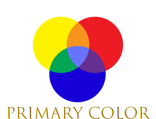
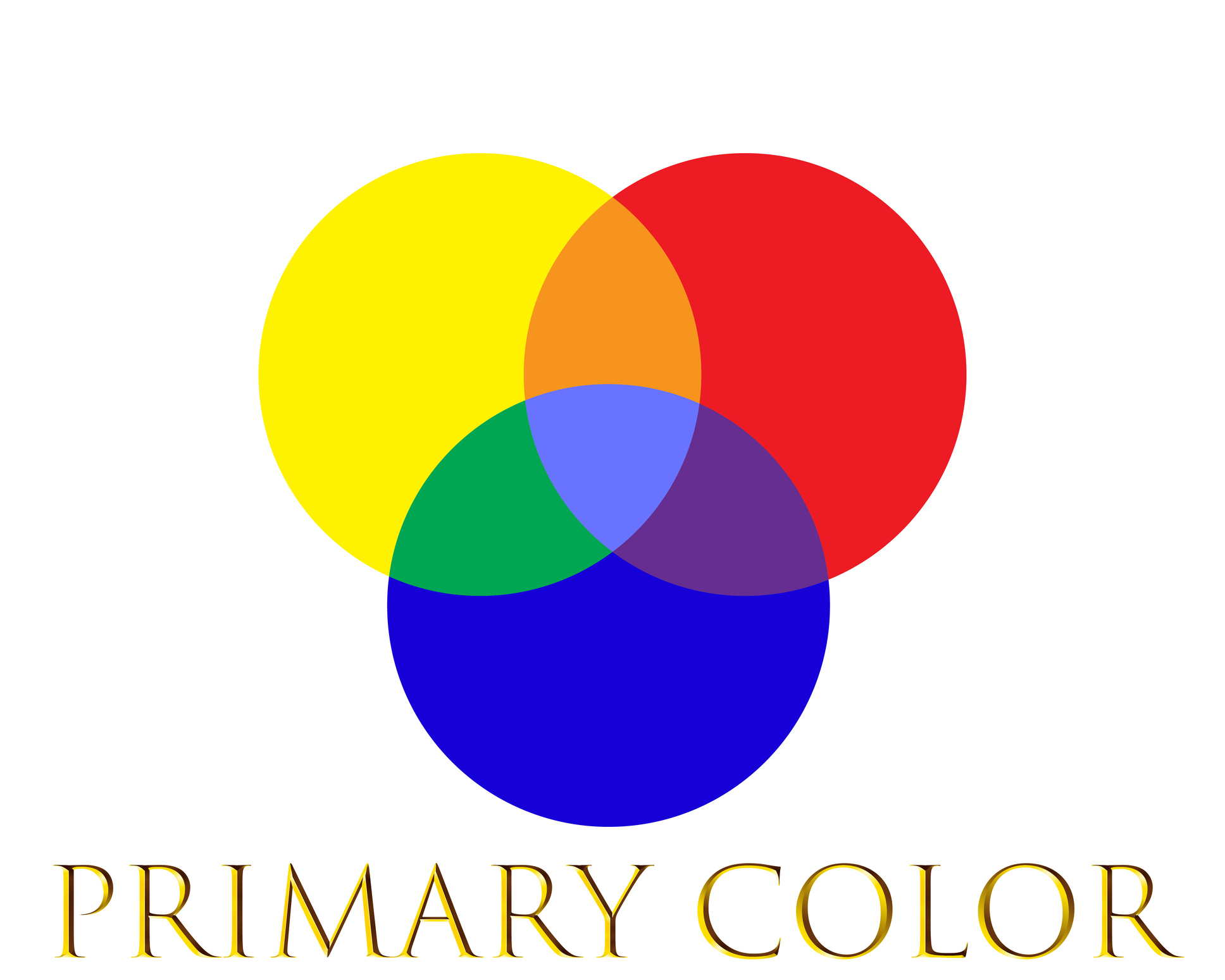
One of my favorite new “toys” is my color wheel. It’s a disc with an interactive wheel on each side that demonstrates the principles of how colors are combined. It is a handy reference for what art students learn in Art 101. But I find it endlessly fascinating and delightful to play with. It shows you how the unique shades in your personal palette might be created. It also shows you the complementary colors – and their variations – to the basic hues: red, yellow, blue, green, purple and orange. It’s a very inexpensive and fun tool that can help you fine tune your awareness in recognizing color and differences of their shades.
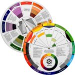
Jim King Color Wheel
The other thing I’ve noticed about color in my home is that my personal style has a big impact on what I keep and what I edit. And yet, even with everything I thought I knew about color I fell into the trap of thinking that my home would look more sophisticated if the colors in my kitchen were consistent.
So, when it came time to replace some cracked wooden stirring spoons I searched for a set of colorful silicone spatulas instead. The set that appealed to me came in shades of navy blue, purple, orange, red, aqua, and black. And there was also one that had each spatula in a different color.
Initially I looked for a darker color that was in my palette thinking it would give my kitchen a classy, Classic look. But Classic is only 25% of my total style blend. So instead, I looked around the kitchen and noticed what brought me joy.
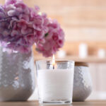
What brought me joy was the colors in my flower vases, the artwork on my walls, and the patterns on the kitchen chairs. They each reflected my color palette as well as the High Spirited qualities of my style, which is 35% of my essence blend. (How our environment reflects our personal style is what my course Discovering Your Inner Style is all about.)
So I opted for this multi color set. And it actually is the most practical one as now I know which type of spatula to reach for based on its color without having to take each one out of the container where I stash them.
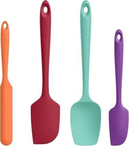
UTaste High Heat Resistant Silicone Spatula Set
So those are ways I’m incorporating color into my life. In my next post I’ll write about what, how, and where we’re seeing color in fashion this year. It’s a wonderful change from the “uniform” we’ve been seeing for the past several years: dark jeans, neutral T-tops, sweaters, and sneakers. (Amusingly, that’s actually my style facet uniform, but I’ll show how I bring in color to give it an update.)
[Full disclosure: these links are from Amazon, so if you purchase anything I might receive a small commission with absolutely no additional cost to you.]

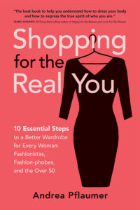
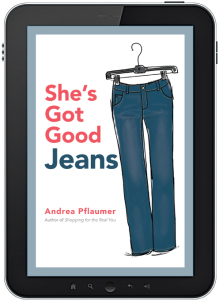
Andrea’s books and new video series:


