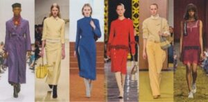
Courtesy of Vogue
We get used to seeing certain colors for the cooler winter months in the Northern Hemisphere: black, dark brown, olive, rust for the cooler autumn days, bright clear reds, emerald greens, and royal blues around the holidays. But this year those colors are taking a back seat. And frankly, I love it.
What we’re seeing is wildly creative. It is color inclusive. And it inspires women to think outside the color “box” that often is associated with each season. There’s still something for everyone here. But unless you are strongly anchored in one color season, none of these are likely going a head-to-toe look for you.
Consider trying a single items paired with one of the other colors that is showing up. That would be a wonderfully energetic and artistic way to play in this trend. And if it is one of your best colors, it won’t be a trend. It will be a long-term item in your wardrobe that speaks to your originality.
So get ready because there’s a LOT to look. I’ve tried include things and at various price points and something for every season and style. (All images are linked).
Nearly Chartreuse
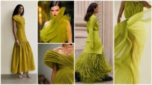 This year’s green is chartreuse. Chartreuse is a color that, if it suits your coloring, can be brilliant in any form – as an accessory, a garment near the face, or a full-body look. If it’s iffy for you but you love it, stick to just using it as an accessory – a shoe, bag, or earring (not a necklace).
In addition to the more yellow leaning versions, a somewhat mossy color is also making its appearance. That variety creates options for several seasonal color harmonies: spring, autumn and winter. It just has way too much yellow/warmth for a summer type.

Old Navy mockneck sweatshirt n Mysterious Fern $13.49
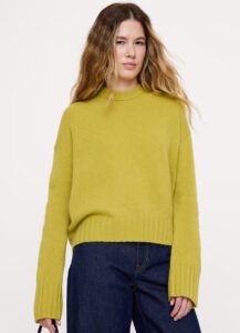
Banana Republic Oversized Midweight Cashmere sweater $230
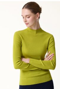
OGLMove Ultra Fine Merino Sweater in Pear Green $79
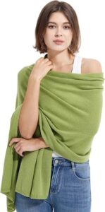
Cashmere Wool Wrap in Avocado $42.99
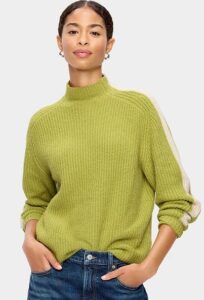
Old Navy SoSoft Sport Mock-Neck Shaker Sweater $24.99
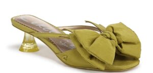
Sam Edelman Natalina Sandal $59.98
Poppy, Flame and Caramelized Orange
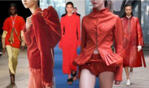
Courtesy of Fashionista
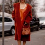
Courtesy of Fashionista
There are somewhat unusual shades of orange and red for the fall and winter. Some of them have elements of brightness but are not strictly a Spring color. Some have saturation but are not strictly within the Winter palette colors. They all have warmth but many might be a tad clear for a true Autumn type. The only season that none of them would work for is Summer, as any oranges will overwhelm their subtlety. Nonetheless, it has energy and a touch of playfulness, especially if the shades are combined as in this outfit to the right.
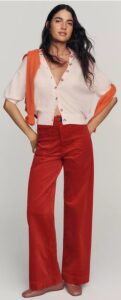
Anthropologie Maeve cotton corduroy pants $148
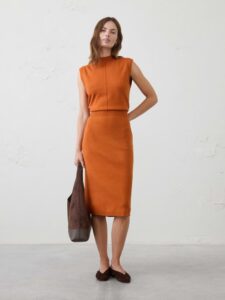
Banana Republic Factory mock neck knit dress $90
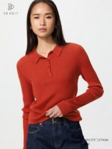
Uniqlo Merino Blend Polo 49.90
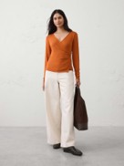
Banana Republic Factory Pumpkin Spice soft wrap top $36
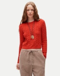
J. Crew Cashmere Shrunken Crew Neck cable knit $178
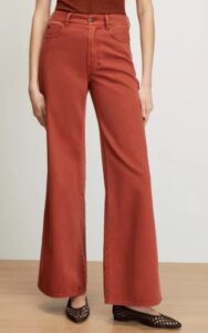
Veronica Beard Kacey wide leg jeans $328
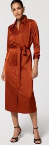
WHBM Satin dress in Rust $90
If you find combining these colors a challenge, another wonderful way to play with color trends is to use them as accents. If you want to give an outfit a little “punch” pick a shape or style that has some more detail in the construction.
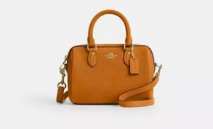
Coach Outlet mini Rowan crossbody bag $179

Ralph Lauren East-West Shoulder Bag at Saks Fifth Avenue $598
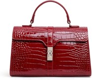
Aidriani leather crocodile texture bag $83 on Amazon
Pale peachy yellow
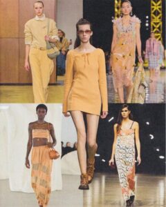
Courtesy of Vogue
One of the biggest surprises is this yellowy-peach shade showing up this fall. This is an unusual color to begin with. You won’t see it in a lot of color palettes. And you won’t find a lot of things in this color in general. It’s primarily the domain of Spring colors with maybe a little extra warmth from Autumn thrown in.
Because of it’s subtlety, it’s possibly a color that would work for a summer type but only for those with a spring or possibly even an autumn secondary. (I write more about the seasonal blends in my course Choose Color First). But for the right person it would be a joyful addition to their cooler weather wardrobe.
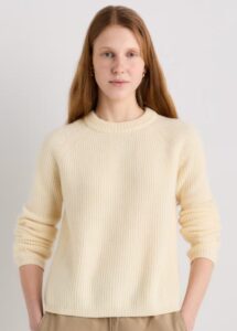
Quince Mongolian Cashmere Fisherman Crew Neck Sweater $99.90
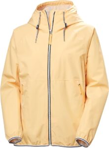
Kelly Hansen Koster Rain Jacket $98

Quince cotton linen sweater in Sandstone Beige $59.99
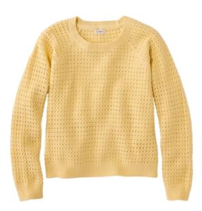
LLBean Openwork sweater in Straw $67.99
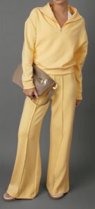
Carbon 38 Half Zip Pullover $148
This time of year faux fur is always popular. Wearing it in this shade would be a playful twist.

Nasty Gal tipped faux fur coat, Macy’s $120
Peachier
Then we go into actual peach shades, another anomaly for the season. As with the above, these are colors that can suit Spring and some Summer and Autumn types who have a spring crossover.
First up are a couple of items in transition colors between peach and the yellows we looked at above.
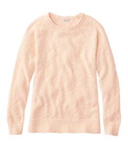
L. L. Bean Women’s Midweight Cotton Slub Rollneck Pullover $34.99
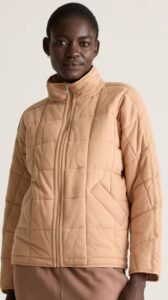
Quince organic cotton quilted jacket in nutmeg $70
This one is from Doen, a high end brand. They call it “alpaca blend”, which in this case means 50% alpaca/28% polyamide/22% wool. At that price I’d want it to have no synthetics, but often the synthetic makes the item a bit sturdier.
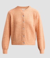
Doen Petra alpaca blend cardigan $328
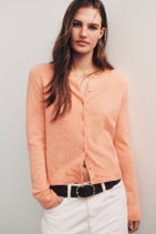
Anthropologie Juliet cashmere cardigan in Heather Apricot $158
And I just love seeing light colors for outerwear in the winter. They create a sense of upbeat freshness to a cold season look. This one is a darker, warmer shade but is still unusual for winter.
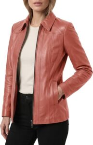
Trend Genesis lambskin leather jacket $182.99
The lighter, paler versions are so fresh.
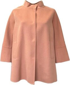
Maria Rinaldi by Max Mara wool blend cape coat $130.95
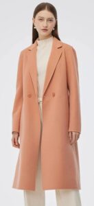
Goelia Peach Coat $189
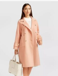
Bell and Bloom wool blend coat at Macy’s – on sale $179.97
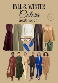
Courtesy of Autumn Love
Reds
And then there are the reds. Oh my goodness, they are so luscious this year – deep, rich, and sensual. They range from a dark purple wine to burgundy and even to the clayish reds.
Quince calls this color “wine tasting red and it’s available in many items here. The dress below is poly and spandex, so if you’re a textile purist you can skip it. But it’s lovely for the holidays or as a wedding guest dress, and like many of their items is a real steal.
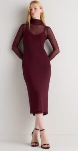
Quince mesh knit mock
Satin trousers remain high on the trends list. I personally don’t consider it a “trend”. I think it’s something that, for the right person, is a perennial wardrobe addition. Satin trousers work beautifully for Romantic types, for Naturals who have a touch of Romantic, and even for Classics. Quince offers them in three more typically neutral colors (black, navy and white). Those could make them basics for a lot of style types and work so nicely for holiday events.
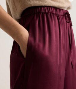
Quince 100% Washable Silk Drawstring Wide Leg Pants $90
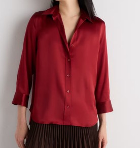
Quince silk blouse in Clay Red $84.90

Quince Deep brick red cotton cashmere dolman sleeve top $44.90
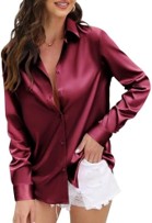
Amazon poly satin wine red button down $19.99
Talbot’s recently started an affiliate site called Haven Well Within. It features comfortable, high quality pieces you might use for lounging, for when you want to do some self care, or for a home day spa. They just added some nice things that have more flexibility to wear beyond the house. I think they’re setting themselves up as an alternative to Quince and Everlane. This one caught my eye.
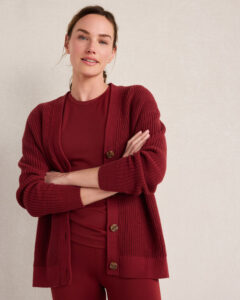
Haven Well Within Organic cotton shaker stitch cardigan on sale $99.99
And then there’s Old Navy. If you read my previous posts or my book, She’s Got Good Jeans, you know that I tired on about 100 different styles and manufacturers of jeans before I found the ones that fit perfectly and didn’t require hemming. These come in petite, regular, and tall versions and sizes from 00 to 30 and are on a ridiculous sale. (They also come in various more traditional jeans washes/colors.)
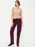
Old Navy OG High Waist Loose Jeans in Raisin Arizona $22.49
Shades of Purple
Purples for the cooler months have traditionally been clearer and cooler, suitable for Winters and Springs. But like the reds, this year’s are either warmed up or grayed down, giving the Autumn and Summer color types some nice options. We’re seeing many shades of purple from lavender to royal to aubergine. And we’re seeing LOTS of them.
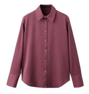
Mango aubergine blouse Macy’s $59.99
Plaid is a big trend right now and Joan Songer, the founder of Personal Style Counselors, said any style could wear plaid patterns. Frankly, I don’t quite understand that, as it feels – to my eye – to be a Natural design/print. Regardless, in these soft colors I don’t think it matters how much Natural you have as long as the color works. Almost any season with some amount of Summer crossover might wear this.
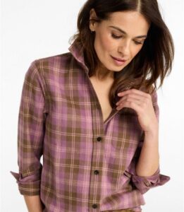
LLBean mauve flannel plaid shirt $59.95:
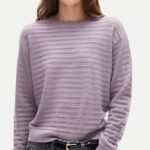
J. Crew Pointelle Cashmere sweater $158
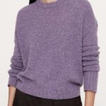
Banana Republic Oversized mid weight cashmere crew sweater $230

Pistola Nadya short sleeved polo alpaca blend 178
This one below might work as a dark neutral for a Summer color type. But, especially for Summer types, I wouldn’t necessarily recommend wearing this color near the face and with black pants, as it’s styled here. These trousers could be paired with a more mauve-y top to soften the look.
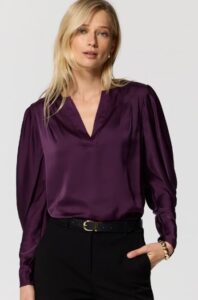
WHBM Purple silk blouse Black Raspberry $89
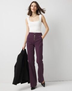
WHBM Pret High Rise Trouser $53.99
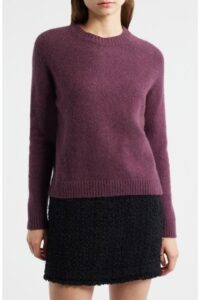
BOSS Fesbian crew neck $279
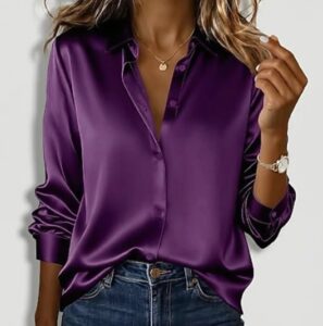
JC Penny Zeagoo poly satin purple blouse $29.99
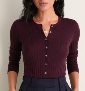
Tuckernuck Ribbed Cashmere/Silk Lowell Cardigan in Plum $198
Pistola Nadya short sleeved polo alpaca blend 178
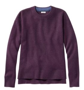
L.L. Bean cotton cashmere pullover in eggplant heather on sale $59.99
Turquoise and Aqua
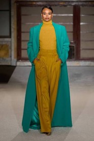
Courtesy of Coveteur
And then aquas and turquoises! What a revelation for the colder season. The high fashion versions are brilliant turquoises, suitable for Winter’s striking coloring. But here are several options that speak for this color trends and work for different palette seasons.
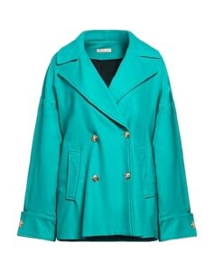
LiuJo Coat on YOOX $218
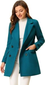
Lake Blue Allegra K Double breasted coat
This one is running out of stock quickly for good reason.
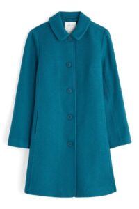
Wood cabin coat in Seaside Cornwall $418
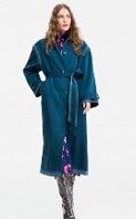
Jonathan Cohen Water ombre effect water repellant trench on sale Macy’s $137.40
This one is from Pretty Garden, one of the Chinese fast fashion sites on Amazon. But they consistently get good reviews. They describe this one as “light green” but it really leans toward aqua. I’m sorely tempted to try it myself. (It also comes in what they call “bean green” which is a lighter green-leaning color.
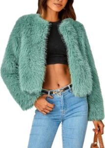
Pretty Garden Cropped Faux Fur jacket $50.99
And if you really want to make a splash, wear this to your holiday parties, maybe with one of the burnt oranges.
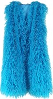
Faefaik shaggy vest on Amazon $47.69
Lighter Aquas
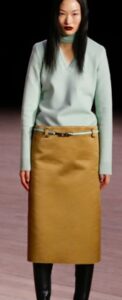 The one on the left was from the Marc Jacobs Fall/Winter 2026 (don’t ask me why the model looks so angry and unhappy :-).
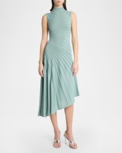
The lighter versions: I bought a cashmere sweater in this color about 20 years ago and still wear it. Lately it seems mostly to be available at the very high end of the market. Neiman Marcus has this one on the right from Alaia at $3500.
But you an always trust Amazon to come up with something.
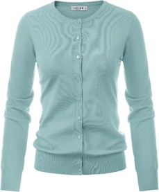
This is from Grace Karin $25.99
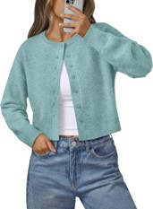
LILLUSORY Womens Lightweight Cardigan Cropped Knit
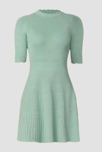
Shoshana Warren knit dress Saks Fifth Avenue $159.20
J. Crew has one that is almost identical in color to the one I have. It’s in what John Kitchener categorized as one of my “refreshing” colors. It’s a pastel, and as I talk about in my Choose Color First course, everyone has some pastels in their palette.
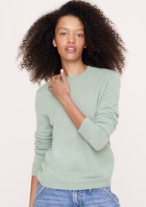
J. Crew Lightweight cashmere Crew in Green Tea $160
Now, if you love it and just want a pop of it for an accent, a wrap is always a terrific option. Most of the lower end ones on Amazon are a rayon/poly blend. These next two have a jacquard pattern making them suitable for a lot of the jacquard and brocade-type textiles we’re seeing this year. These are about equal amount of rayon and acrylic.
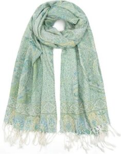
Cliormis Two Tone Silky Paisley Pashmina Shawl $12.74
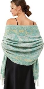
Paisley Pashmina Rave Shawl
Chocolate Brown
And everywhere there is chocolate brown, the “new neutral that works for everyone”, or so it is being touted. So, just as with the confection, there are many shades of what is considered “chocolate”. The ones we’re seeing now are the dark chocolate versions. Browns are not unusual for the colder months, but we’ve seen this dark brown since the spring. For autumn types and some Winters it’s a perennial color. But with the right top it could work for Springs, and possibly a summer/spring crossover.
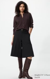
Uniqlo cashmere cardigan $129
I have this cardigan below from Quince and absolutely love it. It’s richer looking than in the photo and very versatile. Works well under a blazer of jacket.

Quince Lightweight Cotton Cashmere Cardigan $39.90
You’ll find it in a lot of the satin slip skirts too. Nordstrom shows one with a tan sweater. It’s a very sophisticated look. Still, if it feels to tame for you, one of the “reds” this season would give this look a little more energy. Or an aqua top or even handbag could make the whole combination sing.
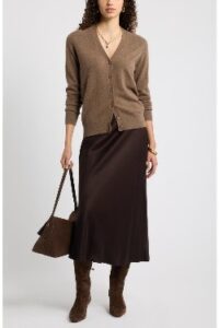
Nordstrom Bias Cut Satin Midi skirt $129
These next two would be fab with that skirt. The orange/tomato color one would make it more casual.
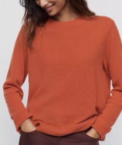
At Anthropologie, Reformation cashmere boyfriend sweater in Tomato $178
The softness, color, and drape of this one would make it more dressy, but it would require some kind of jacket.

Lilysilk cowl neck blouse $119
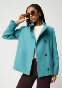
J. Crew Factory Wool-blend short funnelneck coat
$149.00
Or if the combination was monotone dark chocolate, a pop of color could add some nice energy.
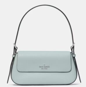
Kate Spade Outlet Gwen Shoulder Bag $89
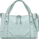
Frye Melissa Medium Satchel $194
As shown in earlier, Quince has their mulberry silk midi and maxi skirts in multiple colors. This one is called “hot fudge. I like how they paired this one with aqua blue boots.
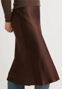
Quince Washable Silk Skirt $69.90
Ralph Lauren knows how to make even a barn jacket look endlessly chic.
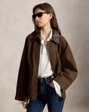
Ralph Lauren utility jacket
And if you like the look but not the price, Gap Factory has this very similar one on sale $54.99
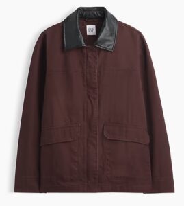
Gap Factory has this similar one on sale $54.99
Leather is always big this time of year but in lighter weights can be a year-round garment. I’ve been considering this jacket for over a year and may finally give it a try. It’s sheepskin, very soft and pliable, and consistently gets terrific reviews. It would be a great finishing touch for so many tops, slacks, jeans, and even skirts and dresses.
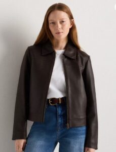
Quince Leather Cropped Zip Front Jacket $225
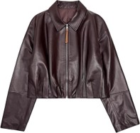
Genuine lambskin from MAAVOO $159.99
In Shopping for the Real You I encourage my readers to buy like crazy when their colors come around in stores and online because the by the next year you won’t see them. Is that ever the case this year!
And for all of my readers in the Southern Hemisphere and all of the Northerners who can’t wait until Spring, here’s a preview of spring colors. Hint: they are riffs on a lot of what we see here for the Autumn/Winter.
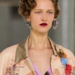
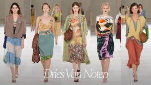 Dries van Noten’s 2027 runway show pretty much covered the entire gamut, in wildly creative ways. Whenever I see these kinds of images I simply take them as inspiration. I consider how I might borrow elements that appeal to me. For example, pairing a “hard” piece like an oversized blazer or jacket, with a “soft” skirt shape or textile. Or experimenting by combining colors I didn’t consider before. Or looking at the proportions that have a pleasing quality. It’s a fun exercise.

So which, if any of these Autumn and Winter color would you wear? And in what garments? Let me know, as you know I LOVE color and would love to hear about your color choices. You get extra brownie points if you send me a photo!
Andrea’s books and new video series: